Ideal Shredders

Representatives of Ideal came to my agency looking to expand their distribution to the United States. With this new start they also wanted to take a different approach that set them apart from more typical office support and supply companies.

Research & Background
When I met with the client a key objective was to differentiate the brand from the competition. There’s been a demographic shift in office managers as millennials have been taking the reins. Some brief competitive research showed most companies in the category had about the personality of a manila envelope. The direction was decidedly to be more modern, bolder, and more exciting.

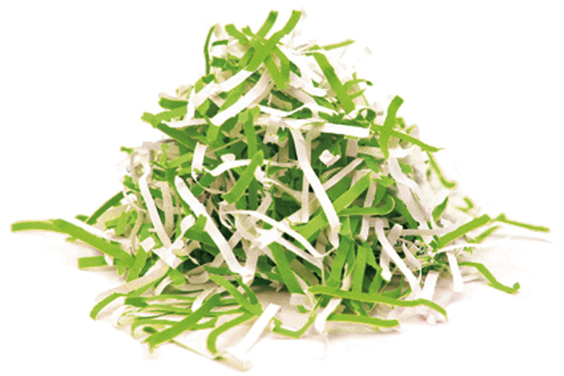
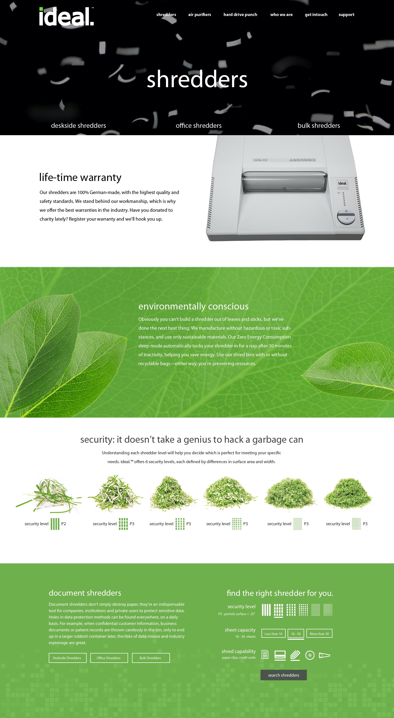
Communicating Security
I used a graphical representation for the different levels of shred particle size. Potential customers might not immediately understand security levels in terms of shredders or particulate size. What is clearer is that smaller pieces mean a document is harder to piece back together.
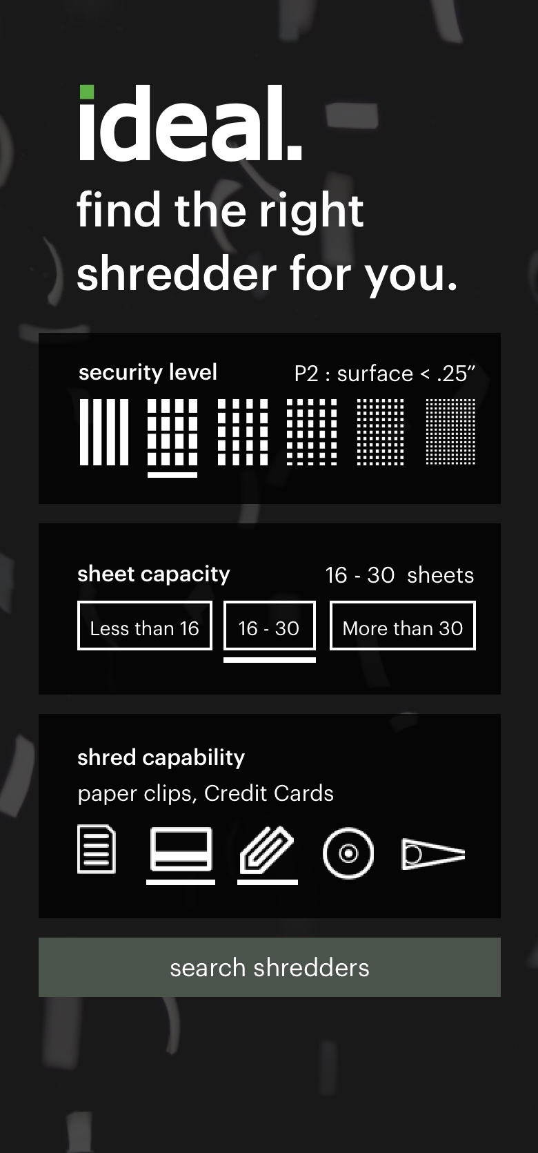
Touch Friendly
I used the more graphic search method as much as possible throughout the site. This made mobile navigation significantly easier. Images were quicker to read and a much larger hit area let users select items faster.

Product Category

I wanted to keep the product list fairly minimalist. Here I made the table header stick to the top of the scroll so that the spec descriptors would always be in view.

Landing Page

We wanted the landing page to differ from anything in the category. I proposed something more graphical with used animation to highlight each section of the page.

Animation Comp This is a quick demo I showed the client for the proposed annimation.